Research Shows Gruen Ad Artists Traced Drawings Directly from Gruen Watch Photographs
Summary... The drawings made by Gruen advertising artists appear to be exact copies of photographs, raising validity of ad image accuracy
July 2015 The best example of advertising accuracy is the last one on the page, the "Veri-Thin Airman" gallery and explanation!
For a number of years there has been debate as to the accuracy of the illustrations used in Gruen advertisements. Some thought artistic license was used liberally while others believed that drawings were quite accurate. My personal belief is well-known to be that Gruen, as a detail oriented company, not a sloppy one, would not have their products be shown in an inaccurate fashion in their advertisements. The illustrations used in the ads replaced what would today be photographs. In the 1940s Color printing of photographs would have been very expensive, if it was even possible. So artist drawn illustrations were the stand-in.
These debates tend to be held when a watch identification is being attempted and a watch doesn't match one shown in an ad. My experience has been that when the watch being identified doesn't match an advertisement's illustration, it is not the watch that is depicted. A number of times I've seen identifications overturned because the artistic license fuzzy-logic was used for the initial ID and when the real model illustration was located, it had a 100% match.
Dials and hand styles are the portion of the ad that can vary validly, but the master drawing was still done using the picture of a watch. Some watches always used the same dial, other used a single dial for say 80% of that model, and some watches that had dials that varied more uniformly. The changes often followed a particular portion of the period the watch was manufactured.
The best way to ensure accuracy of a drawing is to directly work from a photograph, and the most accurate way of illustrating a watch is to trace the photograph so that it was a direct copy.
However, there are ads that the watches are clearly being stylized. A famous and somewhat racy at the time advertisement for Curvexes showed 3 Curvexes drawn overly exaggerated, but it is quite clear to the reader this was being done as an artistic style, not a photorealistic, catalog style illustration.
The way I tested the accuracy of a couple of watches in particular was to use pictures from the illustration and match them with a photograph of the watch made by Gruen. The advertisement I chose was from Christmas 1945. The two watch illustrations examined matched the photograph of the watch 100%. There is zero doubt in my mind that the tested ads were created using specific watch photographs taken by the Gruen company. The hand positions are 100% matching, the text placement, even the holes in a linked band matched. I can find nothing to refute the theory at all.
The two watches chosen were both mens models. Lady's models will be tested later. They were the Curvex Diplomat and the Veri-Thin Varsity. The Curvex Diplomat was chosen because of the intricacy of the mesh band. The tests were performed using Photoshop's opaque layer controls. One image can be placed over the other and made to be semi-opaque so that the image below it can be seen superimposed. It is actually difficult to see the photograph or the ad separately when superimposed because the do match so well.
There is some amount of error on my part in trying to get the sizes absolutely the same, and while traced, it was a human being's hand used to draw the watch. The error margin is quite small as you'll see.
For the Diplomat you will find these images in the gallery below:
- A side-by-side view of the photo next to the illustration from the ad
- The advertisement itself
- The watch illustrated extracted from the ad
- The photo of the watch
- A green tinted silhouette of the ad drawing superimposed on top of the photograph. This shows the dimensions and outline of the ad on the photo itself
Each of the images in the gallery itself are the same size so one could flip through them using a PC image viewer to see the effect better. The images in this gallery are downloadable as a single zip file using the download button located in the upper right corner of the gallery. I encourage you to download the images from the gallery and try flipping through them on your PC.
The gallery only has the Curvex Diplomat work shown. I also have the Veri-Thin Varsity completed with similar results. I will post those when time is available.
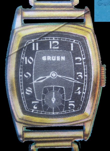
Another advertising image analyzed. The 1940 Gruen Dawson.
These illustrations show the exacting accuracy used by artists when creating the illustration of this Gruen watch. There is little doubt that artists, minimally, traced a photograph of watch dials when creating an illustration.
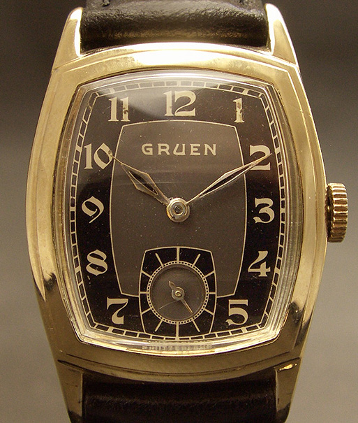
This 1940 Dawson stood out as a good candidate for analysis because the dial is original and pristine. It is another of the fine watches sold by the eBay seller Empressissi. Only the dial was analyzed.
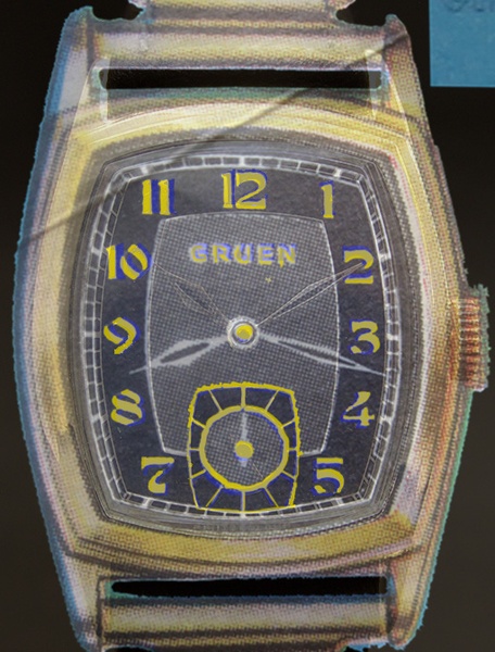
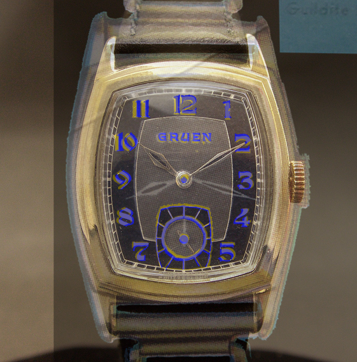
This time I colored the images in a way that it makes seeing the matches/mismatches more easily. On the ad illustration I colored key features with yellow and on the watch illustration in blue. The two images where then placed on top of each other with the ad illustration being slightly opaque so that the photographed dial is also visible. The matched locations of these key features show how the two images are nearly identical and could not have been produced by the artist merely looking at a photograph of the watch. Matched areas include
- Word Gruen under the 12:00 position - Both placement, size, letters
- Center of the dial
- Center of the subseconds
- All lines making up subseconds - Circle, spokes, outline marking the area
- Numerical figures - Placement, size, font
- And, while not highlighted, the inner line work creating the two-tone.
I don't see a way that all of these key features could possibly match by coincidence.
You'll notice that the yellow shows more in one image than the other. The stronger color depends on how see-through you make the overlay layer. If the layer on top is very faint, then the layer below will show through much more and actually appear as if it's on top. So, I have included 2 view, one with the top layer being "thicker" and thus the yellow will show more.
It should also be noted that the only resizing performed was done in a proportional way. In other words, no image was "stretched". It was made larger and smaller in a way such that the width and height proportions never changed. This is a critical part of truthfully showing the artist's rendering, not some convoluted and contorted version of it.
I am including the Photoshop file this time around. So, if you want to play with the images, download the file.

|
1940 Dawson Ad Analysis Overlay.psd Size : 2895.664 Kb Type : psd |
The Photoshop file used to create the above images.
Ad Analysis of a Veri-Thin Airman
One final ad analyzed and I'll leave the topic alone. But I thought this one demonstrated Gruen's dedication to advertising AND to precision. From all of the ads, company newsletters, press statements, pretty much anything written by Gruen mentions Precision and just how proud they are to be the precision watch of their day. I believe this precision adjective became a mantra for everything Gruen did. It lends itself to every facet of the organization and every task an employee can undertake. Iy's clear that this was a core value at Gruen and they had a platform to show the public their dedication to precision and excellence.
This particular example I'm using is an illustration of a Veri-Thin Airman watch. It doesn't look overly photorealistic, but we'll soon see that it is photo precise. There was nothing left to chance on this drawing. It is clearly a traced illustration of a photograph of a watch. This ad shows precision not just between the ad and the watch, but between all Gruen watches that were this model. If I can take a photo of a Gruen watch, and the dial lines up so precisely within the case, and the lettering of the dial is at a tolerance of 1/2 mm or better, then that means the same level of precision must be happening from one watch to the next.
It can be summed up in a simple logic statement IF A=B AND B=C then A=C. Let's replace the symbols IF (The ad illustration) = (photo of a watch 1) AND (The ad illustration) = (photo of watch 2) THEN (photo of watch 1) = (photo of watch 2). OK, perhaps overly complex. Let's get on with the analysis.
I used Photoshop, but this time a little differently (the correct way to prove this). Here were the steps taken that are illustrated in the Gallery
1. A nicely drawn Veri-Thin Airman ad was located
2. A photograph of a Veri-Thin Airman, taken by Gruen was chosen
3. Using a scan of the ad, draw red paint over various areas around the dial. Areas were chosen on opposite ends to get the most coverage. Text was chosen as it's easy to check for a match.
4. Take away the ad illustration so that only the red paint is shown
5. Overlay this red paint onto the scanned photograph of the watch
6. Compare
The precision that the red paint lines up with the physical watch is nothing short of amazing. There is zero doubt that the illustrated watch was meticulously drawn by tracing the photo.
The only location that they did not perfectly line up.... the minute hand. The watch was running a minute slower than the ad : - ) You cannot see this with the red paint, but rather I let it be shown in the final image, the ad superimposed onto the photo. You cannot tell there is an advertisement laid down on top of that photo.... except, check out the minute hands. They're just a tad off. Everything else is a perfect match.
I continued checking the rest of the watch using the case, etc, and they too matched with absolutely perfect overlays.
THIS is an example of dedication to precision the extended all the way down to the artist's hand making that advertisement. Gruen clearly wanted their ads to be exactly the same watch as what you will see when you go to your jewelry store to buy one.
All material are copyright © 2014 by Second Hand Press.
Permission for re-use or distribution, in any format, is not implied nor granted.